
こんにちは、makeshopデザイン質問掲示板担当です。
いつもmakeshopをご利用いただきありがとうございます。
この記事では
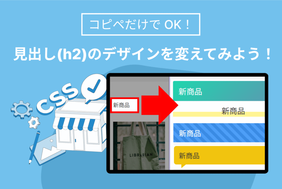
「HTMLを編集せずにCSSの追記だけで見出し(h2)を装飾したい」
という方向けに、コピペ(コピー&ペースト)で使える CSS を20パターン用意しました。
見出しタグ(h2)って何ですか?
HTMLタグで見出しタグと呼ばれています。このhは、heading(見出し)の略称です。
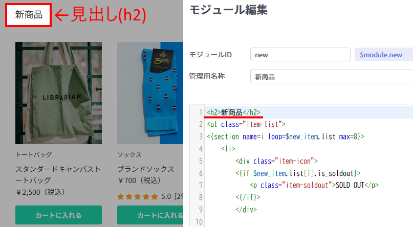
クリエイターモードの【Complete】テンプレートではトップページで呼び出しているモジュール「新商品」や「おすすめ商品」の商品リストの上に
<h2>新商品</h2>
のようにHTMLで記述されています。
CSSって何ですか?
CSS (Cascading Style Sheets)とはWebページの文字の色や大きさなどのスタイル(見た目)を設定する言語です。今回のデザイン変更はCSSの追記だけでおこないます。
追記後は「新商品」の箇所以外にもトップページの見出し(h2)タグで指定されているすべての箇所に適用されます。
CSSにつきましては、下記のサポート記事もあわせてご参照ください!
【初めてのHTML/CSS】CSS(スタイルシート)の基本の書き方と「id/class」について
早速やってみよう!
やり方は超シンプルです。
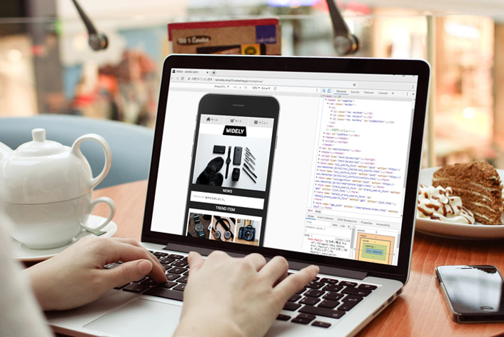
1. 【Complete】テンプレートを追加
2. 好きなデザインの CSS をまるごとコピー
3. 反映させたいCSSを「CSS」欄の末尾にペースト
今回は【Complete】テンプレートのトップページにのみ適用させたいので、
こちらに追記をおためしください。
※複数デザインを同時に貼ると競合します。必ず1つずつ使ってください。
例としてサンプルショップ【Complete】にコピペした場合と同じ表示例をのせています。
(基本的にクリエイターモードのすべてのテンプレートで使用可能ですが、記述位置や内容によってはテンプレートの初期値のCSSの影響などで意図した表示にならない場合もございます。ご注意ください)
万が一にそなえてデザイン編集する前にバックアップをとりましょう!
うっかり変なところにコピペしちゃったかも!?そんな場合にもバックアップがあれば大丈夫です!
関連記事:ショップデザインバックアップしてますか?!
Design 01:シンプル下線
シンプル下線
/* ---- h2 シンプル下線 ---- */
h2 {
  font-size: 1.6rem;
  border-bottom: 3px solid #1FD5AD;
  padding-bottom: 4px;
  margin-bottom: 20px;
}
Design 02:二重ライン
二重ライン
/* ---- h2 二重ライン ---- */
h2 {
  font-size: 1.6rem;
  margin-bottom: 20px;
  border-bottom: 7px double #666;
}
Design 03:左右リボン
左右リボン
/* ---- h2 左右リボン ---- */
h2 {
  font-size: 1.4rem;
  background: #ff7675;
  color: #fff;
  padding: 8px 32px;
  margin-bottom: 20px;
  position: relative;
  display: inline-block;
}
h2::before {
  content: '';
  position: absolute;
  left: 0;
  top: 50%;
  transform: translate(-100%, -50%);
  width: 0;
  height: 0;
  border-top: 12px solid transparent;
  border-bottom: 12px solid transparent;
  border-right: 12px solid #ff7675;
}
h2::after {
  content: '';
  position: absolute;
  right: 0;
  top: 50%;
  transform: translate(100%, -50%);
  width: 0;
  height: 0;
  border-top: 12px solid transparent;
  border-bottom: 12px solid transparent;
  border-left: 12px solid #ff7675;
}
Design 04:マーカー風ハイライト
マーカー風ハイライト
/* ---- h2 マーカー ---- */
h2 {
  font-size: 1.6rem;
  display: inline-block;
  padding: 0 4px;
  background: linear-gradient(transparent 60%, #fff493 60%);
  margin-bottom: 20px;
  width: 50%;
  text-align: center;
}
Design 05:左ボーダーアクセント
左ボーダーアクセント
/* ---- h2 左ボーダー ---- */
h2 {
  font-size: 1.6rem;
  border-left: 8px solid #e67e22;
  padding-left: 12px;
  margin-bottom: 20px;
  background: #fafafa;
}
Design 06:ボックス+ふんわり影
ボックス+ふんわり影
/* ---- h2 シャドウボックス ---- */
h2 {
  font-size: 1.4rem;
  background: #fff;
  border: 1px solid #ddd;
  border-radius: 6px;
  padding: 12px 16px;
  box-shadow: 0 2px 6px rgba(0,0,0,.08);
  margin-bottom: 20px;
}
Design 07:グラデ背景×白文字
グラデ背景×白文字
/* ---- h2 グラデーション ---- */
h2 {
  font-size: 1.6rem;
  background: linear-gradient(135deg, #1FD5AD 0%, #9b59b6 100%);
  color: #fff;
  padding: 12px 18px;
  border-radius: 4px;
  margin-bottom: 20px;
}
Design 08:吹き出し
吹き出し
/* ---- h2 吹き出し ---- */
h2 {
  font-size: 1.4rem;
  background: #f1c40f;
  color: #333;
  padding: 12px 16px;
  border-radius: 8px;
  margin-bottom: 20px;
  position: relative;
}
h2::after {
  content: '';
  position: absolute;
  bottom: -12px;
  left: 24px;
  border: 12px solid transparent;
  border-left: 15px solid #f1c40f;
}
Design 09:右上コーナーリボン
右上コーナーリボン
/* ---- h2 コーナーリボン ---- */
h2 {
  font-size: 1.4rem;
  background: #2ecc71;
  color: #fff;
  padding: 12px 16px;
  margin-bottom: 20px;
  position: relative;
}
h2::after {
  content: '';
  position: absolute;
  right: 0;
  top: 0;
  border-width: 10px;
  border-style: solid;
  border-color: #27ae60 #27ae60 transparent transparent;
}
Design 10:センターライン
センターライン
/* ---- h2 センターライン ---- */
h2 {
  font-size: 1.6rem;
  text-align: center;
  margin-bottom: 20px;
  font-weight: 600;
  position: relative;
  color: #333;
}
h2::before,
h2::after {
  content: '';
  position: absolute;
  top: 50%;
  width: 30%;
  height: 2px;
  background: #e0e0e0;
}
h2::before { left: 0; transform: translateY(-50%); }
h2::after  { right: 0; transform: translateY(-50%); }
Design 11:ドットアンダーライン
ドットアンダーライン
/* ---- h2 ドットアンダーライン ---- */
h2 {
  font-size: 1.6rem;
  border-bottom: 3px dotted #888;
  padding-bottom: 6px;
  margin: 5px 0;
}
Design 12:ドロップシャドウ
ドロップシャドウ
/* ---- h2 ドロップシャドウ ---- */
h2 {
  font-size: 1.8rem;
  font-weight: 700;
  color: #333;
  text-align: center;
  text-shadow: 0 2px 4px rgba(0,0,0,.25);
  margin: 5px 0;
}
Design 13:下線グラデーション
下線グラデーション
/* ---- h2 グラデ下線 ---- */
h2 {
  font-size: 1.6rem;
  padding-bottom: 8px;
  margin-bottom: 20px;
  border-bottom: 4px solid transparent;
  background: linear-gradient(90deg, #ff9d00, #ff3750) left bottom/100% 4px no-repeat;
}
Design 14:ストライプ背景
ストライプ背景
/* ---- h2 ストライプ ---- */
h2 {
  font-size: 1.5rem;
  color: #fff;
  padding: 12px 18px;
  margin-bottom: 20px;
  background: repeating-linear-gradient(45deg, #4e9ef7 0 10px, #3a8be4 10px 20px);
}
Design 15:両サイド太線
両サイド太線
/* ---- h2 両サイド太線 ---- */
h2 {
  font-size: 1.6rem;
  text-align: center;
  margin-bottom: 20px;
  position: relative;
}
h2::before, h2::after {
  content: '';
  position: absolute;
  top: 50%;
  width: 40px;
  height: 4px;
  background: #555;
}
h2::before { left: 0; transform: translateY(-50%); }
h2::after  { right: 0; transform: translateY(-50%); }
Design 16:オーバーライン(上線)
オーバーライン(上線)
/* ---- h2 オーバーライン ---- */
h2 {
  font-size: 1.6rem;
  border-top: 4px solid #ff7e00;
  padding-top: 10px;
  margin-bottom: 20px;
}
Design 17:シャドウ付き立体文字
シャドウ付き立体文字
/* ---- h2 シャドウ付き立体文字 ---- */
h2 {
  font-size: 2rem;
  font-weight: 900;
  color: #fff;
  text-align: center;
  text-shadow: 2px 2px 4px rgba(0,0,0,0.3);
  padding: 12px 20px;
  margin-bottom: 20px;
  display: inline-block;
  background: #ff4081;
  border-radius: 6px;
}
Design 18:ポップ角丸タブ
ポップ角丸タブ
/* ---- h2 ポップ角丸タブ ---- */
h2 {
  font-size: 1.5rem;
  font-weight: 700;
  color: #fff;
  padding: 12px 28px;
  border-radius: 30px;
  display: inline-block;
  margin-bottom: 20px;
  background: linear-gradient(135deg, #00bfa5 0%, #00e676 100%);
  box-shadow: 0 4px 8px rgba(0,0,0,0.15);
  position: relative;
}
h2::after {
  content: '';
  position: absolute;
  bottom: -6px;
  left: 50%;
  transform: translateX(-50%);
  width: 80%;
  height: 6px;
  background: rgba(255,255,255,0.2);
  border-radius: 3px;
}
Design 19:枠囲みグラデーション
枠囲みグラデーション
/* ---- h2 枠囲みグラデ ---- */
h2 {
  font-size: 1.6rem;
  padding: 12px 16px;
  margin-bottom: 20px;
  border: 4px solid;
  border-image: linear-gradient(45deg, #f50057, #2979ff) 1;
  border-radius: 6px;
}
Design 20:斜めグラデ+文字傾き
斜めグラデ+文字傾き
/* ---- h2 斜めグラデ+文字傾き ---- */
h2 {
  font-size: 1.6rem;
  color: #fff;
  padding: 16px 24px;
  margin: 48px 0;
  display: inline-block;
  background: linear-gradient(135deg, #673ab7 0%, #9c27b0 100%);
  transform: skewY(-10deg);
  transform-origin: top left;
  border-radius: 4px;
}
色・サイズを変えるコツ
1. 背景色と文字色は「読める?」を合言葉にコントラストをチェック
→背景色はbackground、文字色はcolorで指定されています🔍️
2. スキマ感が気になるときは padding/margin を増減してみよう🤏
3. 角丸と影は border-radius / box-shadow の数値を動かしてみよう👍️
4. 好きな色に替えたい時はカラーコードを入れ替えるだけ(例:#1FD5AD)🎨
※カラーコードは外部サイトを参考にしてください。外部参考サイト:カラーコード表
いかがでしたでしょうか。
好みのデザインを貼り付けて、ショップの見出しをアップグレードしてみてください!
それではまた!


